Showing posts with label Graphic Design. Show all posts

Sunday, June 2, 2013

Back To School!


I am FLABBERGASTED and humbled by the amazing talent represented by the artists who will be in my class at Lilla Rogers' Studio School.  I've met most of them in a private group on Facebook, and now I am running to sharpen my pencils and clear my work spaces and get
 In The Zone 
for the start of this online class tomorrow.  

My work tables in Ocean Isle Beach, where I will be taking part of this course.

My graphics work desk in Atlanta, Georgia, where I will also be  working.

As a participant in the class, we will not only be getting invaluable input from Lilla Rogers and her staff for five intensive weeks, but we will also be entered in a Global Talent search sponsored by Lilla Rogers Studio for the Next Big Thing.  The entrants will have their work judged by industry experts and art directors.  Shivers!

Class starts tomorrow, and I can hardly wait.  

Tuesday, September 13, 2011

Above and Below The Waters -

 Here's what I'm up to in the Studio right now - I'm designing, printing, and assembling a group of Hand-Bound (actually, The Cinch Bound) Journals, with the theme of Above and Below The Waters. 

There are Blowfish:


And Octopusses...


You've already seen the Coral Bouquet, under construction:


And I couldn't resist pushing the Coral Branch design on out -


A flotilla of Sailboats:


More sailboats to come, but now I have to go to work!


I'll show you The Cinch Bookbinding Tool in action later on today - I'm off to the studio!

Thursday, August 4, 2011

Diagonals and Happiness

This week, I've been working on my entry for the Spoonflower Shark Design Contest, and after hours and hours of work and still coming back to the same design, it occurred to me why I'm doing that.  It's because the visuals that automatically get my attention and make my shoulders relax for a moment always have diagonal lines them:

That Trellis just had to be in there...had to.

Most all flowers make me smile, but the ones that were on top of the Rocky Mountains just grabbed me by the heart and eyes...take a look at all those diagonals pointing back to their centers:

Look at me, Look at me!


In Art School, they teach you the Rule of Threes and all about Diagonals leading in from the Upper Left, Lower Right, Lower Left...you get the picture.  They point to things and make your eyes Happy that they don't have to look around for the Most Important Part!

And then there are the Complicated Diagonals:

The Diagonal in this group is...the group of Hot Pink and Purple blooms spilling down from upper center left to lower right.  
Those hot pink and purple flowers spill diagonally across the picture, but what gives me so much pleasure in this group is the gentle curve in the line...feels soft and sensual, like relaxing against someone you love.

The very Stylish Vera knew all about the lines in any arrangement~
Look at this early photo of my Mother-In-Law, Vera.  She knew that the single diagonal strap on her bikini top was the perfect style point to catch the eye...not to mention the placement of her right arm and left leg for this photo.  They lead your eye right to her face, and the strap emphasizes...well, you know!

When we were traveling from Denver up to Keystone Lodge, we stopped about halfway to check out Georgetown, an old mining town that looked intriguing - plus it had a rest stop.  When we got out of the car, we were greeted with cool, dry air.  Which made us grin.  And all around us were towering peaks...diagonals pointing to the blue sky and back down to the perfect valley!

And it was there that I snapped the Happiest Diagonal photo of the trip:


I have no clue who this man is; when he saw I was taking enthusiastic pictures of the mountains with my Iphone, he happily jumped in front of the camera and posed with his arms raised in the classic, universal sign of Happy Victory.  Victory for escaping the heat of the plains below.  We laughed at each other without speaking - he moved away to his car and we got in ours.  I can't believe we never spoke, but shared such a happy moment. A Happy Diagonal moment.


Monday, August 1, 2011

Adobe Illustrator CS5 Live Trace

Now that the Snapping Turtle Saga is (hopefully) over, I can get back to work on Adobe Illustrator CS5.  The tutor, Jay Montgomery from WyzAnt came on Friday, and we covered the Live Trace function.  He was great!

Basically, Live Trace "traces" a 
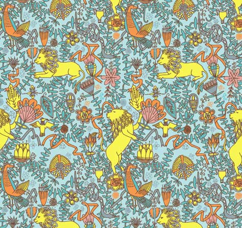
raster image - a raster image is a photograph, (the Flower Photos from Colorado!) or a graphic created in Photoshop - in preparation for turning it into a 
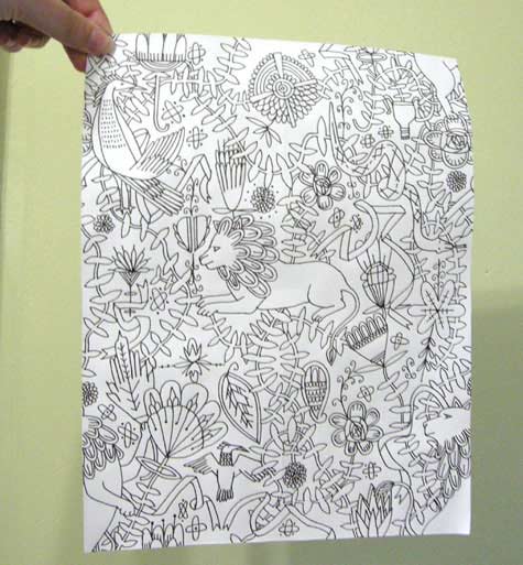
vector image.  The resulting line of the trace is called a Path, with hundreds of little anchor points along the way.  In order to turn the raster image (groups of thousands of little colored squares) into one or more flat planes of color which have  numerical values which can be blown up to the size of a building,  Illustrator "Traces" the image and starts you down the Path to simplify the image and turn it into planes of solid color.

I won't run through the steps to get here - there are literally Hundreds of tutorials on the web about how to use Live Trace -  but essentially, this is the command center in Illustrator that begins the process:


Why do this?  Because if you were to take a photo (a Raster Image) and try to enlarge it to a Building Sized Image, it would get all Pixelated - blurred and confused with millions of little squares trying to be much bigger than they can be.

And this isn't even Near Building size - see what I mean?
 
You can simplify the image in Photoshop before you "Place" it into the Illustrator CS5 program by cleaning up the Noise, separating parts of the image so that you have individual components that make up the whole, and making sure to save it as a PSD image. 

Now, here is the most beneficial thing to come out of the Friday session - there is a tool in Illustrator CS5 that is so exciting, I can hardly wait to get proficient on it.  You see, when I upload a design file to either Spoonflower Fabric Printing or Adaptive Textiles Fabric Printing, to get the best color match I need to use LAB color. 

The color blankets are from Adaptive Textiles, the fabric swatch of Fishing Coral is from Spoonflower.


Since I normally work in sRGB mode (because that is the color mode the monitor is), I've had to calibrate the monitor to the printer as best I can and then print it out in CMYK color.  Because that's the color mode the printer is.  Then spend hours and hours trying to match the color on the hard copy to the color blankets that Adaptive Textiles sent to me.  Sometimes Days.

Well.  Illustrator CS5 has a little color wheel icon parked right in the upper toolbar that is Powerful, Powerful, Powerful!  When you select your artwork, you can click on the icon:

And it opens this function:


Now, here's the good part. I can change the color mode while I am in the Recolor Artwork Screen to LAB color mode.

There is a tiny little icon that lets you change the color mode to LAB.
And then, all I have to do is plug in the numbers from the Adaptive Textiles color blanket for the color I want, and BOOM!  I'm done.

How cool is that?  I mean, how COOL is that?  I'm off to practice now!

Sunday, July 10, 2011

Beach Cottage Bookbinding Studio

While we were waiting for Baby Blakely to arrive, I have been busy figuring out how to use all my new Bookbinding tools, and I think I finally have a good start on the process.  

The Beach Cottage studio is a mess, with Book Parts laying around everwhere:

These are some of the patterns I am going to make fabric out of...works for Books, too!


My first Book was okay, but not exactly even from front to back cover:

This Mango image is meant to be printed on Linen and framed under glass...time to get it done, now that I see it again.  It took me weeks and weeks to create this image - and I just forgot about it!

Living at the Beach, I'm partial to Coastal and underwater images...and my all-time favorites are images of Coral Branches and Sea Fans.  So I designed the following image over a year ago, and it was the first one I experimented with by having Spoonflower print it up for me:

Gluing up the Book Covers is agonizing.  Pure T.   But I am pleased with the finished look.

Once I finally got happy with the front and back Book Covers, I was off to the races, and started assembling:

Don't you think this would make beautiful fabric for a Lula Belle Handbag??  Or Wallpaper for a Beach Cottage accent wall??  Or how about Gift Wrap??  I started with the Coral image, then put it in repeat with other components to make the pages.  You can visit my post on making a Pattern Repeat to see how to do this.

The inside pages are lined and blank, meant for journaling or note jots:


And, here is the back cover:

All Done!


Next up, the Pomegranate Book - but that will be after I go see Baby Blakely again.


I think it's time to get the sewing machine cranked up and Sew "Stuff" to these Book Covers; and layer them up - what do you think?

Monday, July 4, 2011

How to Design a Half-Brick Repeat with Photoshop

Here is a quick tutorial to follow up on my post on how to create a Pattern Repeat.  You can use Photoshop (of course!) to do all the work for you after you've created your image.  Here's how.

Design an image - don't let the design go all the way to the edge of your canvas.  Make your image square.  Your image can be a print or painting that you scan into your computer, or something that you create using your computer.  Open it in Photoshop.  Then, to practice and get comfortable with this process, RESIZE your image to something that is fairly quick to handle - say, 500 pixels by 500 pixels at 72 DPI/PPI.  You can get serious later with higher resolution.


I've made this with a lot of Contrasting Colours so that you can see it better, even though the design doesn't make a lot of visual sense.   This image is 500 x 500 pixels.


Now, open a new blank canvas that is 500 x 500 pixels.  Then go to your image canvas, click on the Select Menu, and click "All".  

This selects your entire canvas quickly and accurately.


Go to Edit Menu, and click on Copy.  Move to your blank canvas, and click Edit, then Paste.


Now you have two identical screens, one with your original image, and one with the new canvas and your image layered on top.  

To begin your Half-Brick Repeat, you must double the width of your "New" canvas.  You do this by going from the Image Menu - select Resize, then Canvas Size.  You'll see a screen that shows you the current size of your image (500 x 500 pixels), and a section labeled "New Size".  In that section, make the WIDTH of the canvas exactly double, or 1000 pixels.  Keep the height the same as your original image.  Before you click OK, select the anchor on either the right or the left so that you get a full 500 pixels added to one side of your existing canvas, not 250 on each side.

See the Anchor arrows - this will make sure that the additional width is added to one side.
Now your canvas looks like this:


Duplicate this layer.  You can name it or not - I usually don't because I'm moving too fast!


To "drop" the image by 1/2, go to the Filter menu, choose Other, then "Offset". 


On the Offset Screen, enter the original width of your canvas in the Horizontal block, and half that value in the Vertical block.  This will drop your image by half.

 Now your image looks like this:

Flatten the layer after Offsetting it.
 Now you can fill in the blank areas with anything you want - just don't touch the edges!  Go back and look at How to Design A Pattern Repeat to see how Julia Rothman filled in her design. 

I filled mine in with Doodles and such, just to show you how to fill it out...


After you've filled in your design, be sure to flatten it if necessary, then Select All again, and move to the edit menu and select "Define Pattern From Selection".  Name the pattern the same name as your new file.

Open a new canvas at least twice as large as this pattern - 2000 x 2000 pixels.  This will allow you to see your repeat better.  Select -> All, then Edit-> Fill Selection, using your newly named pattern.  And this is what it looks like!


Now you can adjust your "additions" to make sure they are pleasing to the eye when filling a large expanse, and don't create an obvious line (like mine did up the middle).  Once you do this a couple of times, it will be so easy.  Now, get to designing!

Tuesday, June 28, 2011

How to Design a Pattern Repeat

When I first started designing images that I uploaded to Spoonflower for digital printing, I was centering the images for use on an 18" x 18" pillow.  The images had "White Space" all around them, because they were centered on the pillow, like a framed painting.  That left plenty of room for the seams, trims, and the zipper at the bottom of the pillow.  Then I started fiddling around with putting my images into repeats, with the idea that they could be used for wallpaper or gift wrap.

Spoonflower's in-house software can put your images into various repeats, like this Half Brick repeat shown on a Paul Stuart tie:


This is their Blue Printed Surfer tie.  See how the surfer shifts over on every other row?   That is a simple Half Brick repeat, and is pretty for small objects...or in small doses.  You wouldn't want several yards of 54" wide fabric printed like this, or the image would turn into a ditsy sea of dots.

To get an image to Flow across a large expanse, with no obvious start or finish, you have to use a few tricks.  


There is no defined center when you look at this Waverly fabric called Hidden Reef- it just flows seamlessly from side to side, and also from top to bottom.   Although it looks very complicated to create, it is actually quite simple.

After months of experimentation with Photoshop and their Offset Filter, I came across this straightforward tutorial in how to create a seamless repeat that flows effortlessly.  Julia Rothman shows us how she created this pattern:


Here is the text of Julia's tutorial:


"One of the questions I frequently get emailed is -how do you make a repeat pattern? I thought it would be fun today to do a little tutorial showing you how simple it is even with a very complex drawing. And you don’t even need a computer! (I usually do my repeats on the computer but today I’m doing it the way I was first taught.) Here’s the old fashioned way of making a tile-able design:


On a clean piece of paper draw a design in the middle of your paper without letting any of the drawing touch the edges- this is very important. (I am going to draw lions and vine-y things- an influence from last months visit to the American Folk Art museum in nyc.)


Once you finish the middle space as much as you want you are going to cut your drawing in half- scary I know- but that’s why computers are helpful. Once you have the two pieces flip them and tape your drawing back together. Put the tape on the back of the paper so it doesn’t obstruct your drawing at all later. Also try to tape your drawing back together as perfectly lined up as possible. It’s hard to see that I’ve even taped mine since I’ve lined it up so well. Next you are going to cut your drawing in half again the other way- (yikes!) and flip those pieces and tape them back together. Now your design should be on all the edges only and you have a big middle white space. Now fill this space with the rest of your design. Remember again- do not draw to any of the edges of the paper.

Once you finish filling in all the parts you want to fill in you now have your repeatable tile. You could color this tile and then xerox it many times and line up your design- plaster it on your walls and make wallpaper. I am going to cheat and do the final coloring steps in the computer to finish up my design. I am going to scan my drawing, take it into Adobe Illustrator, color and repeat it there."


I used Julia's tutorial to go to Photoshop and use the Offset Filter to whack my design into quarters, like she did, and then just filled in the center with the whole (original) design.  You could always put something different in there...the sky is the limit!

Now to figure out a half-drop, tileable repeat...any suggestions out there??

Monday, June 27, 2011

Beach Cottage Renovation Finished!

After my two month hiatus to tend to the Beach Cottage renovation, I have GOT to get back to Textile and Graphic Design.  So that I don't feel like I left everyone in the middle of the road, here are some shots of our finished renovation - that I am just so in love with.  Pictures aren't hung yet, because I can't bear to put holes in the walls yet!  Maybe tomorrow.

The "sewing/create something" room is now totally white.  I took the old kitchen peninsula and made a cutting/pattern table out of it.  And, look at my new window by the sewing machine!
This is what it looked like before:


Big Change, there!

Kitchen all finished!
My yummy new tub, that USED to be my closet!
The mirrors tilt!
Wooden blinds coming tomorrow - do you remember how this looked a month ago?  Yikes!
This was the bathroom on May 24.  What a difference, huh?

     So much work, soooo much work.  But I am happy, happy, happy.  And now it is time to get back to Surface Design...graphics, textiles, Illustrator and Photoshop.  In my clean new house!


LinkWithin

Related Posts Plugin for WordPress, Blogger...