Showing posts with label Spoonflower. Show all posts

Monday, September 29, 2014

Swimming in the Milan Spring Summer 2015 Catwalk

Will you just look at this fabulous-ness?
Emilio Pucci for SS 2015.

                                                                                      
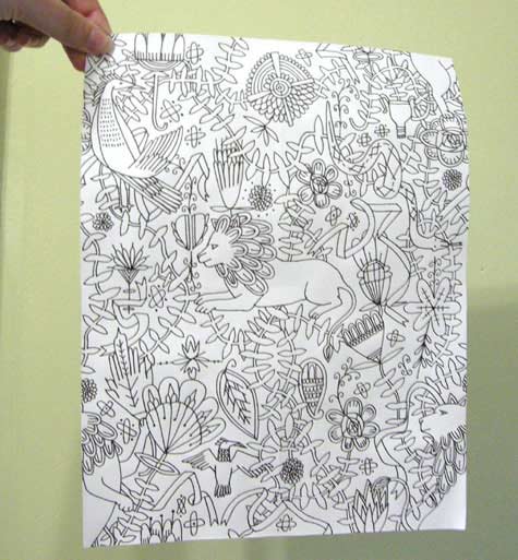
And this from Stella Jean?


This is serious eye candy, and a sumptuous teaser for the palettes and styles you are going to see in the Spring and Summer of 2015.  


Gorgeous colors and flow-y, drape-y and swish-y styles are going to permeate the landscape of the streets, restaurants, shops and parks next Spring...how lovely is THAT??


The only thing I love more than layered swish-y fabrics is the sartorial look, which is a great counter point to this look and has a flirty tension all its own...but that post is for later.  Right now, just look at these colours and patterns!


The Milan Catwalk for Spring/Summer 2015 was simply delightful.  
The palettes and patterns presented by some of my  favorite fashion designers 
made me smile out loud.  And I'm utterly delighted that although I had no clue 
what they would present on this September's catwalks, I've apparently been 
swimming in the same pond without knowing it since April.
I had started a new collection based on one of our trips this Spring, 
but was hesitant to finish it out... 
I felt like it was too "Out There" - too Saturated.  Too Landscape-y.  
Now, I can lay those fears to rest and finish those collections with a party in my heart.

Look at Stella Jean's lovely skirt and blouse: 
Stella Jean SS 2015

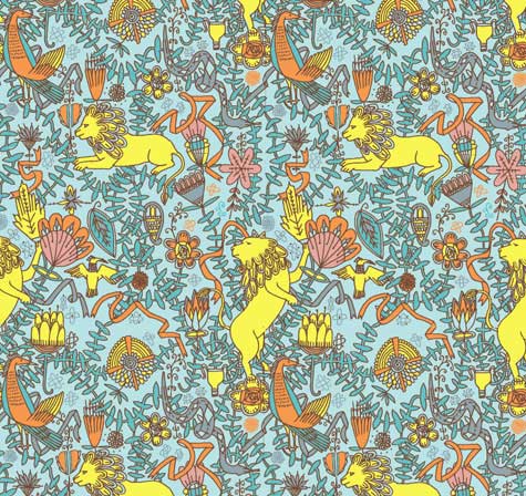
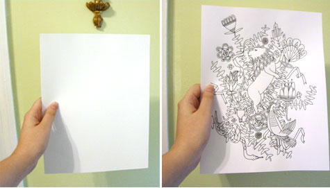
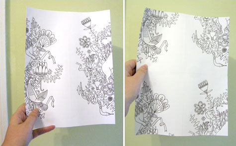
And...here is my Cottage Porch Collection, started in June of this year.  When I saw Stella Jean's "Houses On a Hill" walking down the catwalk, I nearly 
fell out of my chair with delight!


Now, take a look at this close-up of one of Just Cavalli's dresses:


                                                              And this serving of scrumptiousness from Stella Jean:


Don't you want to go get a big spoon and just 
eat this up??

(In my next life
I am going to be
5'10" and have
gorgeous hands
and a long neck...)  


With these lovely images in my head and heart, how could I NOT be dancing in my studio? 

Now that I've gobbled up this catwalk, 
I can't wait to get my collections finished and 
posted to my Spoonflower shop. 
Lesson learned.  Follow your heart; always follow your heart.

Now, back to working on my new Cavalli Jean Collection!


Wednesday, June 6, 2012

Loosing Weight With My New Gravy

I have to admit to a particular love for gravy and sauces.  Which helped pack an extra 25 pounds onto my small frame.  But I am here to announce my New Favorite Gravy, that is Good on Everything, and has only 35 calories in a half cup.


Mexican Salsa Verde!  Even Husband likes it, and slathers it on chicken or fish with abandon.

Here's how you make it:

Take 6 Tomatillos

Husk them and rinse in cool water - their skin is a little sticky.  Cut them in half and drop them in a saucepan.  Add 3 Garlic Cloves that you've smashed and peeled, 2 or 3 jalapenos that you have sliced open and removed the seeds and ribs from.

Some recipes call for Serrano Peppers, but I love the zip from jalapenos...


Just crush and peel the garlic

No need to chop anything, you are going to put all this in a blender in a few minutes.


Rough chop and toss in half of a big Vidalia Onion


Add water to cover and put on stove - bring to a boil, then turn it down and simmer for about 12 minutes, or until Tomatillos are tender.  Drain the mixture and set aside to cool down a little.

Chop the stems off a bunch of Cilantro, cut the bunch in half, and get your blender or food processor out.  Put the slightly cooled mixture in the blender along with the Cilantro and a good pinch or two of sea salt.  Blend until chunky-smooth, and pour it out into a bowl.  That's it!  Let it sit for an hour (overnight is even better) to allow flavors to develop, and then go to it.


I promise you, your mouth will be pleasantly surprised - it is a little tart, is piquant from the jalapenos,  and has a subtle garlic back-flavor that complements everything we've put it on. Even on the forbidden (but once a month treat) of grilled red meat!


Enjoy with a vengeance, because even if you ate a whole cup, it is only 70 calories!

I'm going to make another batch while I wait for FedEx to arrive with my new/new/new Spoonflower Color Map.  Third time HAS to be the charm...

Monday, August 1, 2011

Adobe Illustrator CS5 Live Trace

Now that the Snapping Turtle Saga is (hopefully) over, I can get back to work on Adobe Illustrator CS5.  The tutor, Jay Montgomery from WyzAnt came on Friday, and we covered the Live Trace function.  He was great!

Basically, Live Trace "traces" a raster image - a raster image is a photograph, (the Flower Photos from Colorado!) or a graphic created in Photoshop - in preparation for turning it into a vector image.  The resulting line of the trace is called a Path, with hundreds of little anchor points along the way.  In order to turn the raster image (groups of thousands of little colored squares) into one or more flat planes of color which have  numerical values which can be blown up to the size of a building,  Illustrator "Traces" the image and starts you down the Path to simplify the image and turn it into planes of solid color.

I won't run through the steps to get here - there are literally Hundreds of tutorials on the web about how to use Live Trace -  but essentially, this is the command center in Illustrator that begins the process:


Why do this?  Because if you were to take a photo (a Raster Image) and try to enlarge it to a Building Sized Image, it would get all Pixelated - blurred and confused with millions of little squares trying to be much bigger than they can be.

And this isn't even Near Building size - see what I mean?
 
You can simplify the image in Photoshop before you "Place" it into the Illustrator CS5 program by cleaning up the Noise, separating parts of the image so that you have individual components that make up the whole, and making sure to save it as a PSD image. 

Now, here is the most beneficial thing to come out of the Friday session - there is a tool in Illustrator CS5 that is so exciting, I can hardly wait to get proficient on it.  You see, when I upload a design file to either Spoonflower Fabric Printing or Adaptive Textiles Fabric Printing, to get the best color match I need to use LAB color. 

The color blankets are from Adaptive Textiles, the fabric swatch of Fishing Coral is from Spoonflower.


Since I normally work in sRGB mode (because that is the color mode the monitor is), I've had to calibrate the monitor to the printer as best I can and then print it out in CMYK color.  Because that's the color mode the printer is.  Then spend hours and hours trying to match the color on the hard copy to the color blankets that Adaptive Textiles sent to me.  Sometimes Days.

Well.  Illustrator CS5 has a little color wheel icon parked right in the upper toolbar that is Powerful, Powerful, Powerful!  When you select your artwork, you can click on the icon:

And it opens this function:


Now, here's the good part. I can change the color mode while I am in the Recolor Artwork Screen to LAB color mode.

There is a tiny little icon that lets you change the color mode to LAB.
And then, all I have to do is plug in the numbers from the Adaptive Textiles color blanket for the color I want, and BOOM!  I'm done.

How cool is that?  I mean, how COOL is that?  I'm off to practice now!

Friday, July 29, 2011

Coffee Design Fabric Contest Open for Voting

Just a quickie - thanks so much to all of you who voted for my "Fishie Coral"  entry in the  Spoonflower Fabrics  design contest in June: 


Although I wasn't in the top 10, I was thrilled to place in the top 50 - not bad for a first time entry - thanks to all of you!

Now the Coffee Design fabric contest is open for voting - the rules were harder, as you could only use three colors - here's my entry:

A Cuppa Caffe'


You can view all the designs from the many talented fabric artists out there by clicking on this link:  Vote for Coffee Design Favorite.

The Coffee Fabric Design Contest ends August 4, so I hope you'll cruise on over and vote!  Next subject in the Fabric Design Contest......SHARKS!  Now THAT will be a toughie, but I'm on it!

Saturday, July 23, 2011

New Fabric Pattern - A Cuppa Caffe' for the Fabric Contest

This speedy new computer just flew for me today, and the design for the Spoonflower "Coffee" contest is finished - but in three colours only - that's the rule!

Here's the one I entered in the Contest:


I designed a couple of other colorways, just to see if I liked them or not, but the Blue & Tan won out-

I love Red, White and Black together, but can't see this in practical application.


Here's the last one:


This ran a close second for me, but I'm not sure how many people would want a Pea-Green Coffee Bean in their Decor...
The contest voting opens around the end of next week - I do hope you will visit Spoonflower Fabric Printing and vote for your fave!

How My Pomegranate Book Cost Me A Thousand Dollars

All Rightee Then.  When I finished writing about my zippy new Book Binding skills, I was heading into the "Pomegranate Book" at the end of that post.

The Pomegranate Book covers...before I looked closely.


That was before Arthritis hit with a vengeance, and I was out of action for days and days.  When I finally eased back into the studio again and picked up the ready-to-go Pomegranate Book covers and started to work with them, it became VERY apparent that the black toner didn't cover the paper evenly.  So I turned the paper around, re-printed...and then re-calibrated and re-printed...and so on and on.  I simply could not get a solid layer of black.  Period.


You probably don't know this, but ALL of the stationery, note-pads, catalogs, store signs, hang tags, and Shopping Bag labels for Lula Belle Tassels and Tideline Fabrics were printed on my trusty old HP4500 Color Laserjet printer, that is now about 12 years old.  Thousands and thousands of items printed by this old guy:

I bought this printer in 1999!  Still works pretty good, if you don't mind lots of cuddling and maintenance.  Which I don't.  We have become true-blue friends, and work equally hard in the studio.


He is so old that I have to search out spare parts from  Second Chance Industries on Ebay.  Great bunch of guys down there, who cheer me on for keeping him up and running. 

Considering his age, and the service he has given me, I decided while on the long drive back to Atlanta to quit pushing him so hard and start easing him into retirement.  (He doesn't know this yet.)  Like thoroughbred horses put out to pasture:

Image courtesy of American Farriers Journal
 
Quietly, I started the search for a new printer, and after days and days of shopping, trial runs, and a very knowledgeable technician at Printer Showcase, I realized that although the new laser printers are fast and efficient, they won't handle the heavy, textured cardstock I like to use - they don't lay down enough toner, and they don't "mash" the toner into the paper like my old guy.  The only one I found was the Xerox 6280:

That image looks great coming out of the printer, but it cost about 24 cents to print!!

Great quality, but far too expensive for production runs.  I tested OKI, Ricoh,  Kyocera, HP, and Xerox, and was interested to see the really different print quality coming out of each of them.  And was further intrigued by the incredible range of "set-up" properties offered for each print job.  Most offered 2 or more printing platforms, but the printer that had the widest range of possibilities within my budget was the Ricoh 430dn.  It won't print on textured cardstock, but does print everything else beautifully, for less than .05 cents per page.  So, One Thousand Dollars later, I have a new printer on the way.


All because I loved my Pomegranate Book Design too much to give up, and because I secretly love a pure black background for images.  Thanks to Scot over at Printer Showcase in Marietta for spending the better part of two afternoons working on my needs and running all my test prints to get Just the Right Printer to take the load off my old guy.  Who will still do my textured printing, only not black.

So now, while I wait for my new printer, I'm going to work on the next Fabric Design Contest at Spoonflower Printing!


Sunday, July 10, 2011

Beach Cottage Bookbinding Studio

While we were waiting for Baby Blakely to arrive, I have been busy figuring out how to use all my new Bookbinding tools, and I think I finally have a good start on the process.  

The Beach Cottage studio is a mess, with Book Parts laying around everwhere:

These are some of the patterns I am going to make fabric out of...works for Books, too!


My first Book was okay, but not exactly even from front to back cover:

This Mango image is meant to be printed on Linen and framed under glass...time to get it done, now that I see it again.  It took me weeks and weeks to create this image - and I just forgot about it!

Living at the Beach, I'm partial to Coastal and underwater images...and my all-time favorites are images of Coral Branches and Sea Fans.  So I designed the following image over a year ago, and it was the first one I experimented with by having Spoonflower print it up for me:

Gluing up the Book Covers is agonizing.  Pure T.   But I am pleased with the finished look.

Once I finally got happy with the front and back Book Covers, I was off to the races, and started assembling:

Don't you think this would make beautiful fabric for a Lula Belle Handbag??  Or Wallpaper for a Beach Cottage accent wall??  Or how about Gift Wrap??  I started with the Coral image, then put it in repeat with other components to make the pages.  You can visit my post on making a Pattern Repeat to see how to do this.

The inside pages are lined and blank, meant for journaling or note jots:


And, here is the back cover:

All Done!


Next up, the Pomegranate Book - but that will be after I go see Baby Blakely again.


I think it's time to get the sewing machine cranked up and Sew "Stuff" to these Book Covers; and layer them up - what do you think?

Tuesday, June 28, 2011

How to Design a Pattern Repeat

When I first started designing images that I uploaded to Spoonflower for digital printing, I was centering the images for use on an 18" x 18" pillow.  The images had "White Space" all around them, because they were centered on the pillow, like a framed painting.  That left plenty of room for the seams, trims, and the zipper at the bottom of the pillow.  Then I started fiddling around with putting my images into repeats, with the idea that they could be used for wallpaper or gift wrap.

Spoonflower's in-house software can put your images into various repeats, like this Half Brick repeat shown on a Paul Stuart tie:


This is their Blue Printed Surfer tie.  See how the surfer shifts over on every other row?   That is a simple Half Brick repeat, and is pretty for small objects...or in small doses.  You wouldn't want several yards of 54" wide fabric printed like this, or the image would turn into a ditsy sea of dots.

To get an image to Flow across a large expanse, with no obvious start or finish, you have to use a few tricks.  


There is no defined center when you look at this Waverly fabric called Hidden Reef- it just flows seamlessly from side to side, and also from top to bottom.   Although it looks very complicated to create, it is actually quite simple.

After months of experimentation with Photoshop and their Offset Filter, I came across this straightforward tutorial in how to create a seamless repeat that flows effortlessly.  Julia Rothman shows us how she created this pattern:


Here is the text of Julia's tutorial:


"One of the questions I frequently get emailed is -how do you make a repeat pattern? I thought it would be fun today to do a little tutorial showing you how simple it is even with a very complex drawing. And you don’t even need a computer! (I usually do my repeats on the computer but today I’m doing it the way I was first taught.) Here’s the old fashioned way of making a tile-able design:


On a clean piece of paper draw a design in the middle of your paper without letting any of the drawing touch the edges- this is very important. (I am going to draw lions and vine-y things- an influence from last months visit to the American Folk Art museum in nyc.)


Once you finish the middle space as much as you want you are going to cut your drawing in half- scary I know- but that’s why computers are helpful. Once you have the two pieces flip them and tape your drawing back together. Put the tape on the back of the paper so it doesn’t obstruct your drawing at all later. Also try to tape your drawing back together as perfectly lined up as possible. It’s hard to see that I’ve even taped mine since I’ve lined it up so well. Next you are going to cut your drawing in half again the other way- (yikes!) and flip those pieces and tape them back together. Now your design should be on all the edges only and you have a big middle white space. Now fill this space with the rest of your design. Remember again- do not draw to any of the edges of the paper.

Once you finish filling in all the parts you want to fill in you now have your repeatable tile. You could color this tile and then xerox it many times and line up your design- plaster it on your walls and make wallpaper. I am going to cheat and do the final coloring steps in the computer to finish up my design. I am going to scan my drawing, take it into Adobe Illustrator, color and repeat it there."


I used Julia's tutorial to go to Photoshop and use the Offset Filter to whack my design into quarters, like she did, and then just filled in the center with the whole (original) design.  You could always put something different in there...the sky is the limit!

Now to figure out a half-drop, tileable repeat...any suggestions out there??

Saturday, June 4, 2011

"Fishie Coral" Fabric Entry - Yikers!

Okay, now that I have been to Surtex and the National Stationery Show, it is time to put my money (courage?) where my mouth is.

Ta Daaa!  Here is my first ever entry in a fabric design contest:

"Fishie Coral" by Lula Belle - you can vote in the fabric design contest here: Fabric Design Contest

Spoonflower Custom Fabrics is the first digital printing company I ever used to print my own fabric designs.  They hold weekly design contests, and the competition has gotten stiffer as the months go by.  After dragging my husband up to New York to walk the Surtex surface design show, I knew I was toast - with myself and others - unless I jumped into the pool and got rolling.   So I did.

"Fishie Coral" can be printed on either 42" wide quilting weight cotton or 54" - 58" wide in several different fabrics, including my favorite upholstery weight twill at $32.00 per yard.  The repeat size can be customized by changing the image size on the page where you place orders.   


All you artists out there should take a look at Spoonflower - you can upload your designs and print as little as a $5.00 swatch, or a 21" x 18" piece for $11.00.  Caution: It Is Addictive!

LinkWithin

Related Posts Plugin for WordPress, Blogger...