Showing posts with label Fabric Design. Show all posts

Friday, May 31, 2013

I'm Back!

Wow.  Has it really been since October??  Here we are at the end of May, 2013 and it seems like only yesterday that I put my Blog aside to design new fabrics.

I'm so happy with my new styles and new skills in Photoshop and Illustrator; so happy I took this time off to "get in the zone".  Some of my new collections are POWIE as far as color goes, and some are subtle and calm.  I don't know yet which I like better!

Here are some samplers of some of my new collections:

Penny Baloo


Turtle Bay Blue


Turtle Bay Grey

I'm going with the flow and letting it all pour out - somewhere in all of this, my personal "style" has to emerge!

I have been busy, busy, busy, learning Photoshop CS5 and Illustrator CS5 a little better.  A HUGE help has been this website:

Lynda.com


My tip of the day is that if you are struggling to absorb as much as possible from some new digital software, go and sign up with this website!  There are hundreds of videos to show you how to do just about anything digital.  And the best part is that not only are the teachers great, but you can pause and replay videos endlessly.  

Today is the start of my new online course with Lilla Rogers:

Lilla Rogers online Studio School

And I will keep you posted on how it goes!

Thursday, August 4, 2011

Diagonals and Happiness

This week, I've been working on my entry for the Spoonflower Shark Design Contest, and after hours and hours of work and still coming back to the same design, it occurred to me why I'm doing that.  It's because the visuals that automatically get my attention and make my shoulders relax for a moment always have diagonal lines them:

That Trellis just had to be in there...had to.

Most all flowers make me smile, but the ones that were on top of the Rocky Mountains just grabbed me by the heart and eyes...take a look at all those diagonals pointing back to their centers:

Look at me, Look at me!


In Art School, they teach you the Rule of Threes and all about Diagonals leading in from the Upper Left, Lower Right, Lower Left...you get the picture.  They point to things and make your eyes Happy that they don't have to look around for the Most Important Part!

And then there are the Complicated Diagonals:

The Diagonal in this group is...the group of Hot Pink and Purple blooms spilling down from upper center left to lower right.  
Those hot pink and purple flowers spill diagonally across the picture, but what gives me so much pleasure in this group is the gentle curve in the line...feels soft and sensual, like relaxing against someone you love.

The very Stylish Vera knew all about the lines in any arrangement~
Look at this early photo of my Mother-In-Law, Vera.  She knew that the single diagonal strap on her bikini top was the perfect style point to catch the eye...not to mention the placement of her right arm and left leg for this photo.  They lead your eye right to her face, and the strap emphasizes...well, you know!

When we were traveling from Denver up to Keystone Lodge, we stopped about halfway to check out Georgetown, an old mining town that looked intriguing - plus it had a rest stop.  When we got out of the car, we were greeted with cool, dry air.  Which made us grin.  And all around us were towering peaks...diagonals pointing to the blue sky and back down to the perfect valley!

And it was there that I snapped the Happiest Diagonal photo of the trip:


I have no clue who this man is; when he saw I was taking enthusiastic pictures of the mountains with my Iphone, he happily jumped in front of the camera and posed with his arms raised in the classic, universal sign of Happy Victory.  Victory for escaping the heat of the plains below.  We laughed at each other without speaking - he moved away to his car and we got in ours.  I can't believe we never spoke, but shared such a happy moment. A Happy Diagonal moment.


Saturday, July 23, 2011

New Fabric Pattern - A Cuppa Caffe' for the Fabric Contest

This speedy new computer just flew for me today, and the design for the Spoonflower "Coffee" contest is finished - but in three colours only - that's the rule!

Here's the one I entered in the Contest:


I designed a couple of other colorways, just to see if I liked them or not, but the Blue & Tan won out-

I love Red, White and Black together, but can't see this in practical application.


Here's the last one:


This ran a close second for me, but I'm not sure how many people would want a Pea-Green Coffee Bean in their Decor...
The contest voting opens around the end of next week - I do hope you will visit Spoonflower Fabric Printing and vote for your fave!

How My Pomegranate Book Cost Me A Thousand Dollars

All Rightee Then.  When I finished writing about my zippy new Book Binding skills, I was heading into the "Pomegranate Book" at the end of that post.

The Pomegranate Book covers...before I looked closely.


That was before Arthritis hit with a vengeance, and I was out of action for days and days.  When I finally eased back into the studio again and picked up the ready-to-go Pomegranate Book covers and started to work with them, it became VERY apparent that the black toner didn't cover the paper evenly.  So I turned the paper around, re-printed...and then re-calibrated and re-printed...and so on and on.  I simply could not get a solid layer of black.  Period.


You probably don't know this, but ALL of the stationery, note-pads, catalogs, store signs, hang tags, and Shopping Bag labels for Lula Belle Tassels and Tideline Fabrics were printed on my trusty old HP4500 Color Laserjet printer, that is now about 12 years old.  Thousands and thousands of items printed by this old guy:

I bought this printer in 1999!  Still works pretty good, if you don't mind lots of cuddling and maintenance.  Which I don't.  We have become true-blue friends, and work equally hard in the studio.


He is so old that I have to search out spare parts from  Second Chance Industries on Ebay.  Great bunch of guys down there, who cheer me on for keeping him up and running. 

Considering his age, and the service he has given me, I decided while on the long drive back to Atlanta to quit pushing him so hard and start easing him into retirement.  (He doesn't know this yet.)  Like thoroughbred horses put out to pasture:

Image courtesy of American Farriers Journal
 
Quietly, I started the search for a new printer, and after days and days of shopping, trial runs, and a very knowledgeable technician at Printer Showcase, I realized that although the new laser printers are fast and efficient, they won't handle the heavy, textured cardstock I like to use - they don't lay down enough toner, and they don't "mash" the toner into the paper like my old guy.  The only one I found was the Xerox 6280:

That image looks great coming out of the printer, but it cost about 24 cents to print!!

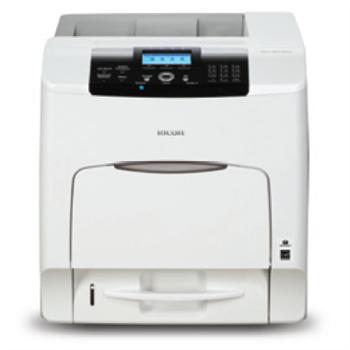
Great quality, but far too expensive for production runs.  I tested OKI, Ricoh,  Kyocera, HP, and Xerox, and was interested to see the really different print quality coming out of each of them.  And was further intrigued by the incredible range of "set-up" properties offered for each print job.  Most offered 2 or more printing platforms, but the printer that had the widest range of possibilities within my budget was the Ricoh 430dn.  It won't print on textured cardstock, but does print everything else beautifully, for less than .05 cents per page.  So, One Thousand Dollars later, I have a new printer on the way.


All because I loved my Pomegranate Book Design too much to give up, and because I secretly love a pure black background for images.  Thanks to Scot over at Printer Showcase in Marietta for spending the better part of two afternoons working on my needs and running all my test prints to get Just the Right Printer to take the load off my old guy.  Who will still do my textured printing, only not black.

So now, while I wait for my new printer, I'm going to work on the next Fabric Design Contest at Spoonflower Printing!


Sunday, July 10, 2011

Beach Cottage Bookbinding Studio

While we were waiting for Baby Blakely to arrive, I have been busy figuring out how to use all my new Bookbinding tools, and I think I finally have a good start on the process.  

The Beach Cottage studio is a mess, with Book Parts laying around everwhere:

These are some of the patterns I am going to make fabric out of...works for Books, too!


My first Book was okay, but not exactly even from front to back cover:

This Mango image is meant to be printed on Linen and framed under glass...time to get it done, now that I see it again.  It took me weeks and weeks to create this image - and I just forgot about it!

Living at the Beach, I'm partial to Coastal and underwater images...and my all-time favorites are images of Coral Branches and Sea Fans.  So I designed the following image over a year ago, and it was the first one I experimented with by having Spoonflower print it up for me:

Gluing up the Book Covers is agonizing.  Pure T.   But I am pleased with the finished look.

Once I finally got happy with the front and back Book Covers, I was off to the races, and started assembling:

Don't you think this would make beautiful fabric for a Lula Belle Handbag??  Or Wallpaper for a Beach Cottage accent wall??  Or how about Gift Wrap??  I started with the Coral image, then put it in repeat with other components to make the pages.  You can visit my post on making a Pattern Repeat to see how to do this.

The inside pages are lined and blank, meant for journaling or note jots:


And, here is the back cover:

All Done!


Next up, the Pomegranate Book - but that will be after I go see Baby Blakely again.


I think it's time to get the sewing machine cranked up and Sew "Stuff" to these Book Covers; and layer them up - what do you think?

Monday, July 4, 2011

How to Design a Half-Brick Repeat with Photoshop

Here is a quick tutorial to follow up on my post on how to create a Pattern Repeat.  You can use Photoshop (of course!) to do all the work for you after you've created your image.  Here's how.

Design an image - don't let the design go all the way to the edge of your canvas.  Make your image square.  Your image can be a print or painting that you scan into your computer, or something that you create using your computer.  Open it in Photoshop.  Then, to practice and get comfortable with this process, RESIZE your image to something that is fairly quick to handle - say, 500 pixels by 500 pixels at 72 DPI/PPI.  You can get serious later with higher resolution.


I've made this with a lot of Contrasting Colours so that you can see it better, even though the design doesn't make a lot of visual sense.   This image is 500 x 500 pixels.


Now, open a new blank canvas that is 500 x 500 pixels.  Then go to your image canvas, click on the Select Menu, and click "All".  

This selects your entire canvas quickly and accurately.


Go to Edit Menu, and click on Copy.  Move to your blank canvas, and click Edit, then Paste.


Now you have two identical screens, one with your original image, and one with the new canvas and your image layered on top.  

To begin your Half-Brick Repeat, you must double the width of your "New" canvas.  You do this by going from the Image Menu - select Resize, then Canvas Size.  You'll see a screen that shows you the current size of your image (500 x 500 pixels), and a section labeled "New Size".  In that section, make the WIDTH of the canvas exactly double, or 1000 pixels.  Keep the height the same as your original image.  Before you click OK, select the anchor on either the right or the left so that you get a full 500 pixels added to one side of your existing canvas, not 250 on each side.

See the Anchor arrows - this will make sure that the additional width is added to one side.
Now your canvas looks like this:


Duplicate this layer.  You can name it or not - I usually don't because I'm moving too fast!


To "drop" the image by 1/2, go to the Filter menu, choose Other, then "Offset". 


On the Offset Screen, enter the original width of your canvas in the Horizontal block, and half that value in the Vertical block.  This will drop your image by half.

 Now your image looks like this:

Flatten the layer after Offsetting it.
 Now you can fill in the blank areas with anything you want - just don't touch the edges!  Go back and look at How to Design A Pattern Repeat to see how Julia Rothman filled in her design. 

I filled mine in with Doodles and such, just to show you how to fill it out...


After you've filled in your design, be sure to flatten it if necessary, then Select All again, and move to the edit menu and select "Define Pattern From Selection".  Name the pattern the same name as your new file.

Open a new canvas at least twice as large as this pattern - 2000 x 2000 pixels.  This will allow you to see your repeat better.  Select -> All, then Edit-> Fill Selection, using your newly named pattern.  And this is what it looks like!


Now you can adjust your "additions" to make sure they are pleasing to the eye when filling a large expanse, and don't create an obvious line (like mine did up the middle).  Once you do this a couple of times, it will be so easy.  Now, get to designing!

Saturday, June 4, 2011

"Fishie Coral" Fabric Entry - Yikers!

Okay, now that I have been to Surtex and the National Stationery Show, it is time to put my money (courage?) where my mouth is.

Ta Daaa!  Here is my first ever entry in a fabric design contest:

"Fishie Coral" by Lula Belle - you can vote in the fabric design contest here: Fabric Design Contest

Spoonflower Custom Fabrics is the first digital printing company I ever used to print my own fabric designs.  They hold weekly design contests, and the competition has gotten stiffer as the months go by.  After dragging my husband up to New York to walk the Surtex surface design show, I knew I was toast - with myself and others - unless I jumped into the pool and got rolling.   So I did.

"Fishie Coral" can be printed on either 42" wide quilting weight cotton or 54" - 58" wide in several different fabrics, including my favorite upholstery weight twill at $32.00 per yard.  The repeat size can be customized by changing the image size on the page where you place orders.   


All you artists out there should take a look at Spoonflower - you can upload your designs and print as little as a $5.00 swatch, or a 21" x 18" piece for $11.00.  Caution: It Is Addictive!

LinkWithin

Related Posts Plugin for WordPress, Blogger...